Published 2 Aug 2026· Updated 29 Aug 2026
Colour Matching on Corrugated Boxes: Pantone, Kraft Paper and Print Variation
Why brand colours look different on corrugated board than on screen or coated paper, and how physical proofs and normal tolerance ranges manage this in production.
Key Takeaways
- Screens display colour using light (RGB) while printed ink reflects ambient light, and corrugated liner is more textured and absorbent than coated paper, which is why a colour that looks accurate on screen can shift once printed on a box.
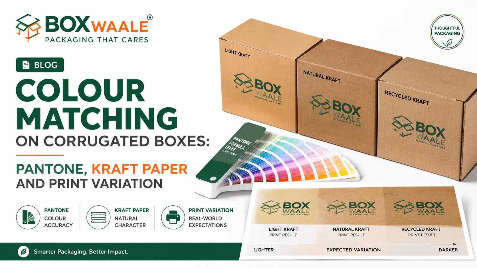
- A Pantone reference gives a defined target for communicating and checking colour, but it does not guarantee a pixel-perfect match on corrugated board because the textured, often brown-toned substrate affects how ink sits and reads.
- Kraft liner's natural brown tone optically mixes with printed ink, so the same ink and the same Pantone target can look noticeably different printed on kraft compared to a white or white-coated liner.
- A physical proof on the actual board and liner combination intended for production is the most reliable way to see how a colour will really look, since a screen mockup cannot fully replicate that interaction.
- Corrugated printing has a normal tolerance range for colour variation between production runs, driven by factors like ink batch, board batch and press conditions, so minor shifts are standard production reality rather than automatically a defect.
- Liner colour itself is not perfectly uniform across every sheet or batch, since kraft is a natural material with some inherent variation, which is a further reason to treat printed colour as a close approximation rather than a lab-exact reproduction.
Colour Matching on Corrugated Boxes: Pantone, Kraft Paper and Print Variation
Table of Contents
Brand teams frequently arrive at their first corrugated print order expecting the same colour precision they're used to from a website mockup or a coated-paper brochure, and are surprised when the printed box looks noticeably different. This is not usually a quality failure — it's a predictable result of how corrugated printing works, and understanding it upfront leads to better conversations with your supplier and more realistic expectations for your finished packaging.
Why Screen Colour and Printed Colour Diverge
A colour on your monitor is made of light — red, green and blue values combining to form what you see. A colour on a printed box is made of ink pigments reflecting ambient light back to your eye, which is a fundamentally different physical process. This is true for any printing, not just corrugated, and it's why designers are generally taught not to finalise brand colours purely by eye on a screen.
Corrugated board adds a further layer of divergence beyond standard print-versus-screen differences. The board's surface is more textured and absorbent than coated paper or plastic, which changes how ink sits, spreads and reflects light. The same ink formulation that prints crisply on a glossy coated carton can look softer, slightly duller or shifted in tone on corrugated liner, simply because of how the material interacts with the ink.
What Pantone References Can and Cannot Guarantee
Pantone colour references are a genuinely useful tool — they give you and your supplier a shared, specific target to communicate against, rather than a vague description like "our brand blue." Using a Pantone reference when briefing custom printed boxes is a good practice and generally improves colour consistency compared to relying on visual approximation alone.
What a Pantone reference does not guarantee is a pixel-perfect, identical match on corrugated board, because Pantone's colour system was developed with a range of substrates in mind, and corrugated liner is one of the more challenging ones to hit an exact reference on, precisely because of its texture and (in kraft's case) its base tone. Reputable suppliers will get as close to the reference as production conditions reasonably allow and will proof the result with you, but should not promise an exact, guaranteed match on every single run without qualification. Treat a Pantone reference as your target and your quality benchmark, not as an absolute guarantee independent of substrate and production reality.
Kraft vs White Liner: The Substrate Effect
One of the biggest factors in how a colour reads on a corrugated box is the liner it's printed on. Brown kraft liner has its own natural tone, and printed ink sits on top of and optically mixes with that base colour, particularly for lighter or more translucent inks. The identical ink and identical Pantone target can look noticeably different printed on kraft than printed on a white or white-coated liner, where the ink sits against a neutral background closer to what most colour systems assume.
This has practical implications for brand decisions:
- If a specific bright or pale colour is central to your brand identity, a white or light-coated liner will generally reproduce it more accurately than kraft.
- If you're using kraft for its natural, eco-conscious visual appeal, plan your colour palette around that base tone rather than fighting it — darker, warmer or more saturated colours tend to sit better on kraft than pale pastels.
- Always ask to see your specific design proofed on the exact liner you intend to use in production, not on a different sample liner.
It's also worth remembering that liner colour itself is not perfectly uniform across every sheet or every production batch, since kraft paper is a natural material with some inherent variation, and even white-coated liners can shift slightly between paper mills or supply batches over time. This is a further reason to treat printed colour on corrugated board as a close, well-managed approximation rather than a laboratory-exact reproduction, and to build that expectation into how you brief designers and evaluate delivered stock.
Proofs and Realistic Production Tolerance
The single most reliable way to manage colour expectations is a physical proof on your actual board and liner combination before a full production run. A proof shows you the real interaction between your ink, your artwork and your specific substrate in a way that no screen mockup, PDF or verbal description can fully replicate. For any order where colour accuracy matters to your brand, this step is worth the small delay it adds to the timeline.
It's also worth setting expectations around run-to-run consistency. Like most large-scale industrial printing processes, corrugated printing has a normal tolerance range for colour variation between production batches, influenced by factors like ink batch consistency, board batch, humidity and press calibration on a given day. Minor shifts within this tolerance are standard production reality across the printing industry, not a defect specific to any one supplier or job. If your brand has strict colour consistency requirements across large or ongoing orders, it's worth discussing tolerance expectations explicitly with your supplier before the run, rather than assuming zero variation is achievable.
How Boxwaale Helps
Boxwaale works with brand teams to translate Pantone references into realistic, proofed colour targets on the actual kraft or white liner they intend to use, rather than promising an exact match sight unseen. We provide physical proofs before full production runs so you can see and approve the true colour on your chosen substrate, and we're upfront about normal production tolerance so there are no surprises on repeat orders.
Frequently Asked Questions
Related Packaging Guide
Planning a packaging order?
Turn this guidance into a box specification
Share the product dimensions, packed weight, quantity, printing requirement and delivery postcode. Boxwaale will help narrow down the appropriate size, ply and board specification before quoting.
Frequently Asked Questions
Related Products
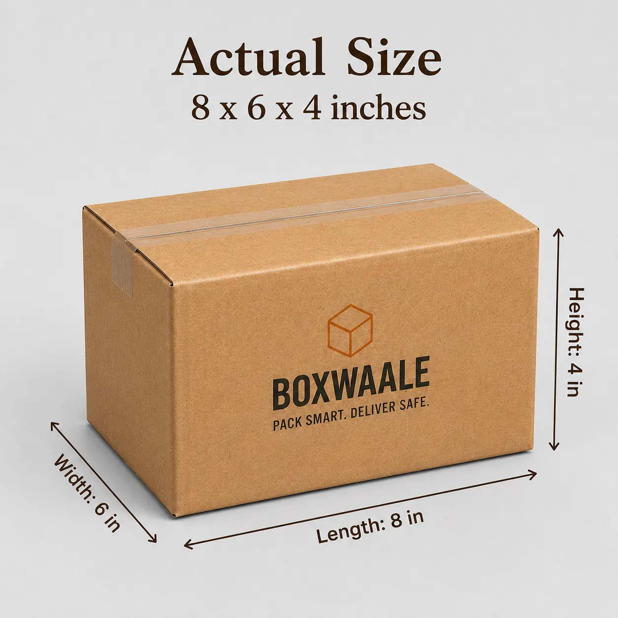
9x6x3 Inch Brown Corrugated Mailer Box for E-commerce Brands
Premium corrugated mailer box designed for e-commerce brands, subscription boxes, gifting, retail products, and custom branded packaging.
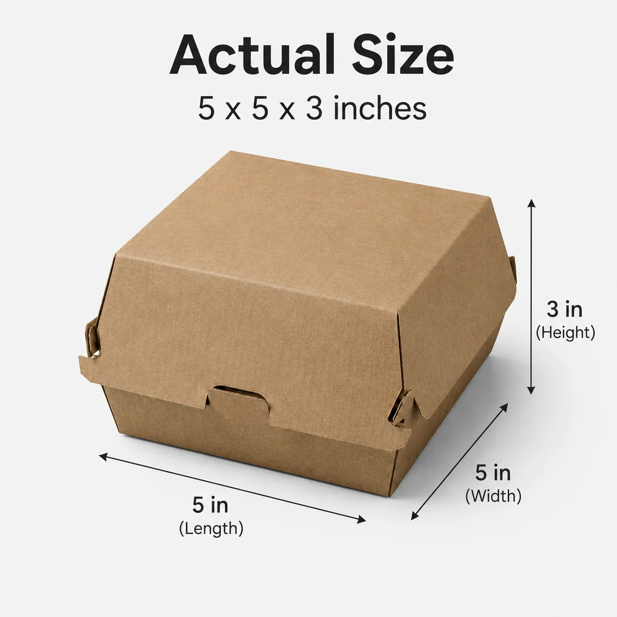
5x5 Inch Brown Kraft Burger Box for Takeaway & Food Delivery
Durable 5x5 inch brown kraft burger box designed for restaurants, cafes, cloud kitchens, and takeaway food packaging.

8x8 Inch Brown Kraft Cake Box for Bakery & Pastry Packaging
Premium 8x8 inch brown kraft cake box designed for bakeries, cafes, cloud kitchens, pastry shops, and dessert packaging.
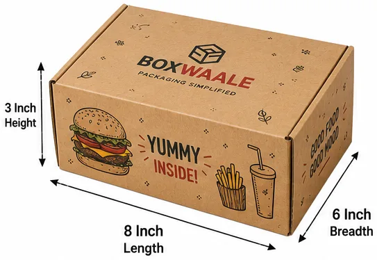
8x6x3 Inch Brown Kraft Burger Meal Combo Box for Food Delivery
Practical brown kraft burger meal combo box designed for burgers, fries, sides, snacks, and food delivery packaging.
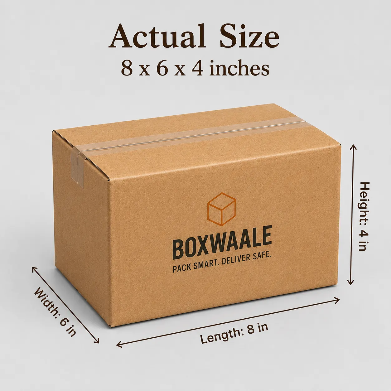
Custom Printed Brown Corrugated Courier Box with Logo
Custom printed brown corrugated courier box with logo designed for online sellers, D2C brands, retail businesses, and branded product delivery.